What skills have you developed through this module and how effectively do you think you have applied them?
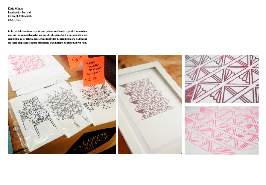
During this module I feel that I have learnt a lot about the industry and about graphic design itself. I have been more focused on what design i like to practice and therefore I think this has shown in my work. I have payed a lot of attention to trying to contact studios in this module, as I would like to gain a placement or internship from it. I have looked into what setting up a studio would be like and released how difficult it would be, this has helped me relies that when I graduate I would like to work for a studio rather than just for myself. The processes which i have done this year have suited my style of work. I have used the facilities much more this year and really enjoyed it, screen printing and using the textiles facilities has made me releases that I would like to do more work relating to this.
What approaches to/methods of design production have you developed and how have they informed your design development process?
What strengths can you identify in your work and how have/will you capitalise these?
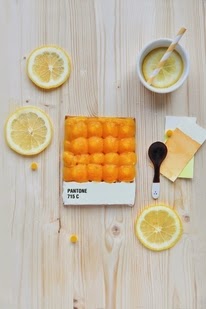
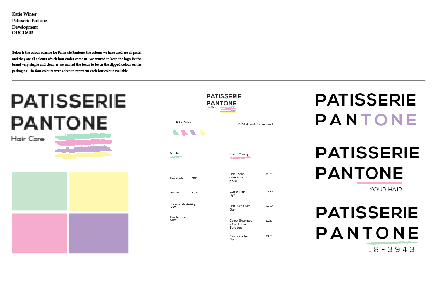
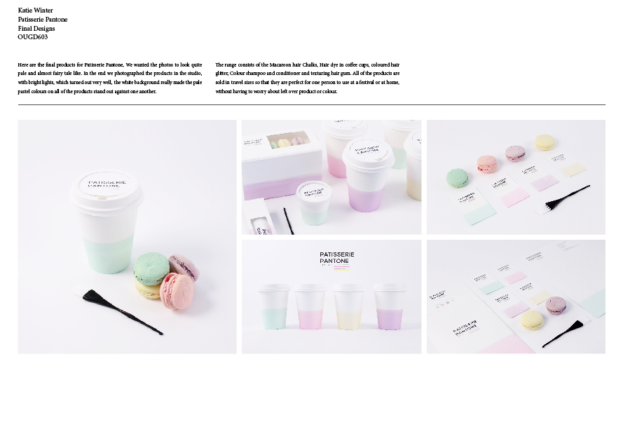
I think due to being more experimental this year I have landed accidentally on things which I would love to do again, For example do the branding and identity as well as the art direction has really inspired my to look into jobs which are not directly graphic design, but are design related. I think this year i have been quite good at contacting studios, I have played a lot of emphasis on this. I have contacted over 150 different studios one the duration of the year and managed to get back a reasonable amount of feedback, as well as getting 3 placements which i didn't think i would be able to get. This has really boosted my confidence.
What weaknesses can you identify in your work and how will you address these in the future?
I think this year one of the weaknesses which are most obvious in my work are mock ups and editing, After taking photograph of specific projects i have found editing very difficult, and in some cases it really effects the end product looking good. This is something which i hope to improve on over time and hopefully it will come more easily to me the more and more i do it.
Attendance- 4 Quantity of work produced- 3
Punctuality- 3 Quality of work produced- 3
Motivation- 5 Contribution to the group- 4
Commitment- 4